Show the code
library(baseballr)
library(tidyverse)
library(dplyr)
library(purrr)
library(lubridate)
library(broom)The 2023 MLB pitch clock represents the most significant pace-of-play rule change in modern baseball. By reducing the time between pitches, MLB sought to shorten game length and increase action. However, a faster tempo also reduces pitchers’ recovery time between pitches, potentially accelerating fatigue. This project analyzes how the pitch clock affects pitcher fatigue within individual outings by comparing several fatigue-related pitch characteristics before and after the 2023 rule change.
To capture differences across pitching roles and styles, I selected five pitchers with contrasting workloads, ages, and mechanics:
Starters: Yu Darvish, Shane Bieber, Corbin Burnes
Relievers: Kenley Jansen, Giovanny Gallegos
These pitchers provide a balanced sample of older vs. younger arms, fast vs. slow tempo workers, and long-outing vs. short-outing usage patterns. I examine three key fatigue metrics across the pre- and post-pitch-clock eras: velocity decline, release extension change, and vertical release point drop.
My central hypothesis is that the pitch clock accelerates fatigue for pitchers who historically relied on longer tempo between pitches.
Specifically:
Older starters (Darvish) will show the largest increase in fatigue after the pitch clock, reflected in steeper velocity decline, reduced release extension, and a lower release point
Younger, efficient starters (Burnes, Bieber) will experience milder changes, since they already worked at a quicker pace.
Relievers (Jansen, Gallegos) will show minimal pitch-clock effects because their outings are short, back-to-back pitches already occur in rapid succession, and fatigue is less likely to accumulate within a single appearance.
Thus, fatigue effects should be strongest for slow-tempo starters, weaker for fast-tempo starters, and minimal for relievers.
This project uses pitch-level Statcast data accessed through the baseballr package in R. For four pitchers, Jansen, Gallegos, Bieber, and Burnes, I downloaded season-by-season pitch data using the statcast_search() function. Darvish’s dataset, which contained all pitches from 2017–2024, was combined from a pre-downloaded CSV file when API inconsistencies prevented automated retrieval. After gathering the data, I used a single processing function (prep_pitcher) to standardize each dataset by converting dates, assigning a pre/post-pitch-clock indicator, arranging pitches in the correct order, and calculating the key variable pitch_in_app, which represents pitch count within each appearance. This variable is central to measuring fatigue: as pitch_in_app increases, each pitcher’s biomechanics and performance can be evaluated for within-appearance deterioration.
Using the cleaned datasets, I built several linear regression models for each pitcher. The first model examined velocity fatigue, using release_speed as the dependent variable. To test whether fatigue increased under the pitch clock, I included an interaction term between pitch_in_app and post_clock. I repeated this modeling framework for two additional fatigue metrics: release extension (release_extension) and vertical release point (release_pos_z). These metrics capture changes in how far down the mound a pitcher releases the ball and whether their arm slot drops over the course of an appearance, both of which are biomechanical signals of fatigue. To visualize these changes, I generated smoothed fatigue curves using geom_smooth() for each pitcher, comparing the pre-clock and post-clock eras across all three metrics.
First, I loaded the necessary packages for this project
library(baseballr)
library(tidyverse)
library(dplyr)
library(purrr)
library(lubridate)
library(broom)Next, I used baseballr to find the playerIDs for each of my players which would allow me to scrape the Baseball Savant site to collect all relevant data.
# Get MLB player IDs
ids <- playerid_lookup("Kenley", "Jansen")
ids
# MLBAM ID: 445276

ids <- playerid_lookup("Yu", "Darvish")
ids
# MLBAM ID: 506433

ids <- playerid_lookup("Giovanny", "Gallegos")
ids
# MLBAM ID: 606149

ids <- playerid_lookup("Shane", "Bieber")
ids
# MLBAM ID: 669456

ids <- playerid_lookup("Corbin", "Burnes")
ids
# MLBAM ID: 669203
For Yu Darvish, I had trouble getting a stable response from the Statcast API, so I exported his pitches from Baseball Savant as a CSV and read them in with read_csv.
darvish <- readr::read_csv("savant_data.csv")

darvish |>
  summarise(
    min_date = min(game_date),
    max_date = max(game_date),
    years    = paste(sort(unique(year(game_date))), collapse = ", "),
    n_games  = n_distinct(game_pk)
  )
For the other four pitchers, I used statcast_search in small helper functions to pull one season at a time. In each get_*_year function, I build a season specific date range from March first through November thirtieth and call statcast_search with that range, the correct playerid, and player_type = "pitcher". I then loop over the years with map, bind the yearly results together with bind_rows, and run a quick summarise to check the minimum and maximum game dates, which years are present, and how many distinct games I have for that pitcher.
#Giovanny gallegos
get_gallegos_year <- function(year) {
  start <- paste0(year, "-03-01")
  end   <- paste0(year, "-11-30")  # end of regular season

  statcast_search(
    start_date  = start,
    end_date    = end,
    playerid    = 606149,
    player_type = "pitcher"
  )
}

years <- 2017:2024

gallegos_list <- map(years, get_gallegos_year)

gallegos <- bind_rows(gallegos_list)

gallegos |>
  summarise(
    min_date = min(game_date),
    max_date = max(game_date),
    years    = paste(sort(unique(lubridate::year(game_date))), collapse = ", "),
    n_games  = n_distinct(game_pk)
  )

#Kenley Jansen
get_jansen_year <- function(year) {
  start <- paste0(year, "-03-01")
  end   <- paste0(year, "-11-30")  # end of regular season

  statcast_search(
    start_date  = start,
    end_date    = end,
    playerid    = 445276,
    player_type = "pitcher"
  )
}

years <- 2016:2024

jansen_list <- map(years, get_jansen_year)

jansen <- bind_rows(jansen_list)

jansen |>
  summarise(
    min_date = min(game_date),
    max_date = max(game_date),
    years    = paste(sort(unique(lubridate::year(game_date))), collapse = ", "),
    n_games  = n_distinct(game_pk)
  )

#Shane Bieber
get_bieber_year <- function(year) {
  start <- paste0(year, "-03-01")
  end   <- paste0(year, "-11-30")  # end of regular season

  statcast_search(
    start_date  = start,
    end_date    = end,
    playerid    = 669456,
    player_type = "pitcher"
  )
}

years <- 2018:2024

bieber_list <- map(years, get_bieber_year)

bieber <- bind_rows(bieber_list)

bieber |>
  summarise(
    min_date = min(game_date),
    max_date = max(game_date),
    years    = paste(sort(unique(lubridate::year(game_date))), collapse = ", "),
    n_games  = n_distinct(game_pk)
  )

#Corbin Burnes
get_burnes_year <- function(year) {
  start <- paste0(year, "-03-01")
  end   <- paste0(year, "-11-30")  # end of regular season

  statcast_search(
    start_date  = start,
    end_date    = end,
    playerid    = 669203,
    player_type = "pitcher"
  )

}
years <- 2018:2024

burnes_list <- map(years, get_burnes_year)

burnes <- bind_rows(burnes_list)

burnes |>
  summarise(
    min_date = min(game_date),
    max_date = max(game_date),
    years    = paste(sort(unique(lubridate::year(game_date))), collapse = ", "),
    n_games  = n_distinct(game_pk)
)After the raw data is in place, I standardize it with the prep_pitcher function. This takes a data frame for one pitcher and a label for that pitcher. Inside the function, I convert game_date to a proper date, extract the calendar year, and create a post_clock variable that is set to one for seasons in 2023 and later and zero for earlier seasons. I then arrange the data by game, at bat, and pitch within each game, and use row_number() within each game_pk to create pitch_in_app, which is the pitch count inside that particular appearance. This variable is my fatigue axis. Finally, I tag each row with the pitcher name, convert pitch_type to a factor, and convert inning to numeric. This function gives me a clean, consistent structure for every pitcher, which is critical for comparing fatigue patterns. I then apply prep_pitcher to each of the five pitchers to get darvish_f, jansen_f, gallegos_f, bieber_f, and burnes_f.
prep_pitcher <- function(df, pitcher_name) {
  df |>
    mutate(
      game_date  = as.Date(game_date),
      year       = year(game_date),
      post_clock = as.numeric(year >= 2023)   # 1 = pitch clock era
    )  |>
    arrange(game_pk, at_bat_number, pitch_number) |>
    group_by(game_pk) |>
    mutate(
      pitch_in_app = row_number()
    ) |>
    ungroup() |>
    mutate(
      pitcher    = pitcher_name,
      pitch_type = factor(pitch_type),
      inning     = as.numeric(inning)
    )
}

darvish_f   <- prep_pitcher(darvish,  "Darvish")
jansen_f    <- prep_pitcher(jansen,   "Jansen")
gallegos_f  <- prep_pitcher(gallegos, "Gallegos")
bieber_f  <- prep_pitcher(bieber, "Bieber")
burnes_f <- prep_pitcher(burnes, "Burnes")Next, I defined a function, fit_fatigue_model, which takes a pitcher’s full Statcast dataset and prepares it for regression analysis. Inside this function, the code filters out any pitches missing velocity or pitch-number information and trims each appearance to the first 80 pitches. This avoids extremely long outings or errant Statcast entries from influencing the slope estimates.
The core of the function is an lm() linear regression where the outcome variable is release_speed, and the predictors include pitch_in_app, post_clock, and their interaction term pitch_in_app:post_clock, along with two control variables: inning and pitch_type. The main slope, pitch_in_app, captures how velocity declines as a pitcher progresses deeper into an appearance before the pitch clock era. The interaction term measures how that slope changes after the pitch clock is introduced. Inning and pitch type are included to control for systematic differences in usage that could result in irrelevant fatigue patterns.
fit_fatigue_model <- function(df) {
  df_model <- df |>
    filter(
      !is.na(release_speed),
      !is.na(pitch_in_app),
      pitch_in_app <= 80   # trim ultra-long outings
    )

  lm(
    release_speed ~ pitch_in_app * post_clock + inning + pitch_type,
    data = df_model
  )
}

model_darvish  <- fit_fatigue_model(darvish_f)
model_jansen   <- fit_fatigue_model(jansen_f)
model_gallegos <- fit_fatigue_model(gallegos_f)
model_bieber <- fit_fatigue_model(bieber_f)
model_burnes <- fit_fatigue_model(burnes_f)

fatigue_slopes <- bind_rows(
  tidy(model_darvish)  |> mutate(pitcher = "Darvish"),
  tidy(model_jansen)   |> mutate(pitcher = "Jansen"),
  tidy(model_gallegos) |> mutate(pitcher = "Gallegos"),
  tidy(model_bieber)   |> mutate(pitcher = "Bieber"),
  tidy(model_burnes)   |> mutate(pitcher = "Burnes")
) |>
  filter(term %in% c("pitch_in_app", "pitch_in_app:post_clock")) |>
  select(pitcher, term, estimate, std.error, p.value)

fatigue_slopes
# A tibble: 10 × 5
pitcher term estimate std.error p.value
<chr> <chr> <dbl> <dbl> <dbl>
1 Darvish pitch_in_app 0.0226 0.00163 8.64e-44
2 Darvish pitch_in_app:post_clock -0.00142 0.00160 3.75e- 1
3 Jansen pitch_in_app 0.0341 0.00298 3.77e-30
4 Jansen pitch_in_app:post_clock 0.0206 0.00763 6.83e- 3
5 Gallegos pitch_in_app 0.0163 0.00203 9.97e-16
6 Gallegos pitch_in_app:post_clock 0.00515 0.00443 2.45e- 1
7 Bieber pitch_in_app 0.00481 0.00122 7.52e- 5
8 Bieber pitch_in_app:post_clock 0.00524 0.00134 8.78e- 5
9 Burnes pitch_in_app -0.00544 0.000719 4.18e-14
10 Burnes pitch_in_app:post_clock 0.000832 0.00104 4.25e- 1Next I combined all pitchers into one single table which allowed me to plot all five of them in one ggplot. The ggplot groups the data by pitcher, clock era, and pitch number, and plots the average velocity for each combination in a line graph.
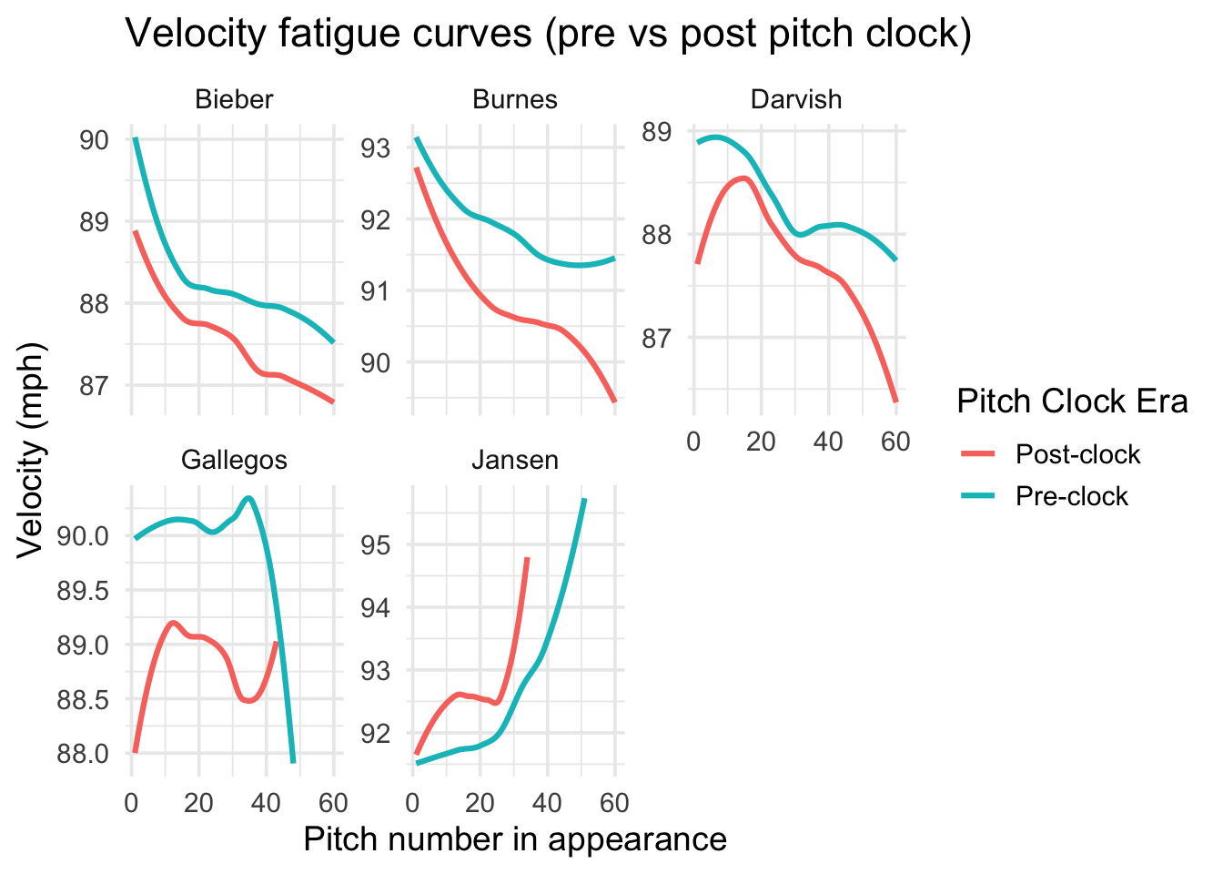
all_pitches <- bind_rows(darvish_f, jansen_f, gallegos_f, bieber_f, burnes_f)

all_pitches |>
  filter(pitch_in_app <= 60) |>
  mutate(clock_label = ifelse(post_clock == 0, "Pre-clock", "Post-clock")) |>
  group_by(pitcher, clock_label, pitch_in_app) |>
  summarise(mean_vel = mean(release_speed, na.rm = TRUE), .groups = "drop") |>
  ggplot(aes(pitch_in_app, mean_vel, color = clock_label)) +
  geom_smooth(se = FALSE, linewidth = 1.1) +
  facet_wrap(~ pitcher, scales = "free_y") +
  theme_minimal(base_size = 14) +
  labs(
    title = "Velocity fatigue curves (pre vs post pitch clock)",
    x     = "Pitch number in appearance",
    y     = "Velocity (mph)",
    color = "Pitch Clock Era"
  )
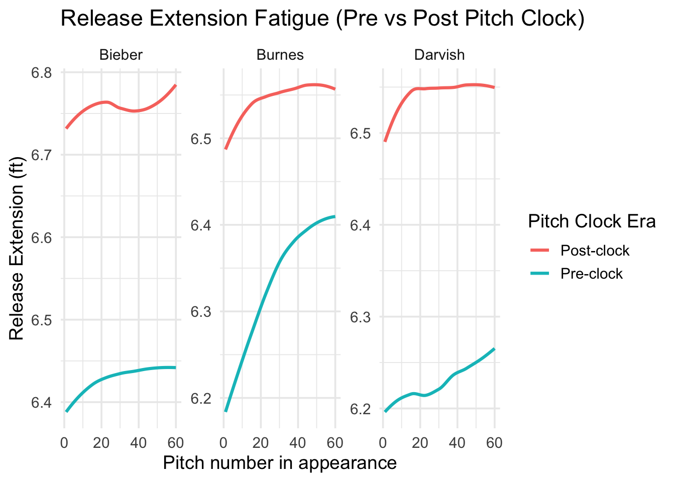
For this section, I shifted the analysis away from relievers because their outing patterns were too irregular to meaningfully model fatigue in single outings. I instead focused on the three starters, Darvish, Bieber, and Burnes, to examine how their release extension changed during an appearance and whether the pitch clock altered that pattern. I began by creating a fit_extension_fatigue function that filters out missing values and trims extremely long appearances, then fits a linear model with release extension as the outcome. The key coefficients again come from the slope on pitch_in_app and its interaction with post_clock, which reveal how extension declines as pitchers tire and whether that decline became steeper after 2023.
fit_extension_fatigue <- function(df) {
  df_model <- df |>
    filter(
      !is.na(release_extension),
      !is.na(pitch_in_app),
      pitch_in_app <= 80
    )

  lm(
    release_extension ~ pitch_in_app * post_clock + inning + pitch_type,
    data = df_model
  )
}

ext_darvish <- fit_extension_fatigue(darvish_f)
ext_bieber  <- fit_extension_fatigue(bieber_f)
ext_burnes  <- fit_extension_fatigue(burnes_f)

extension_results <- bind_rows(
  tidy(ext_darvish) |> mutate(pitcher = "Darvish"),
  tidy(ext_bieber)  |> mutate(pitcher = "Bieber"),
  tidy(ext_burnes)  |> mutate(pitcher = "Burnes")
) |>
  filter(term %in% c("pitch_in_app", "pitch_in_app:post_clock")) |>
  select(pitcher, term, estimate, std.error, p.value)

extension_results
# A tibble: 6 × 5
pitcher term estimate std.error p.value
<chr> <chr> <dbl> <dbl> <dbl>
1 Darvish pitch_in_app 0.00215 0.000289 9.26e-14
2 Darvish pitch_in_app:post_clock -0.0000375 0.000284 8.95e- 1
3 Bieber pitch_in_app 0.00113 0.000256 1.13e- 5
4 Bieber pitch_in_app:post_clock 0.0000792 0.000282 7.79e- 1
5 Burnes pitch_in_app 0.00416 0.0000945 0
6 Burnes pitch_in_app:post_clock -0.000874 0.000137 1.92e-10Next, I combined my three starters’ data into one single table which allowed me to plot all five of their release extensions by pitch in one ggplot. The plot, similar to the previous one, has two lines per pitcher representing pre and post-clock eras respectively.
starters <- bind_rows(darvish_f, bieber_f, burnes_f)

starters |>
  filter(pitch_in_app <= 60) |>
  mutate(clock_label = ifelse(post_clock == 0, "Pre-clock", "Post-clock")) |>
  group_by(pitcher, clock_label, pitch_in_app) |>
  summarise(mean_ext = mean(release_extension, na.rm = TRUE), .groups = "drop") |>
  ggplot(aes(pitch_in_app, mean_ext, color = clock_label)) +
  geom_smooth(se = FALSE, linewidth = 1.1) +
  facet_wrap(~ pitcher, scales = "free_y") +
  theme_minimal(base_size = 14) +
  labs(
    title = "Release Extension Fatigue (Pre vs Post Pitch Clock)",
    x     = "Pitch number in appearance",
    y     = "Release Extension (ft)",
    color = "Pitch Clock Era"   # new legend title
  )
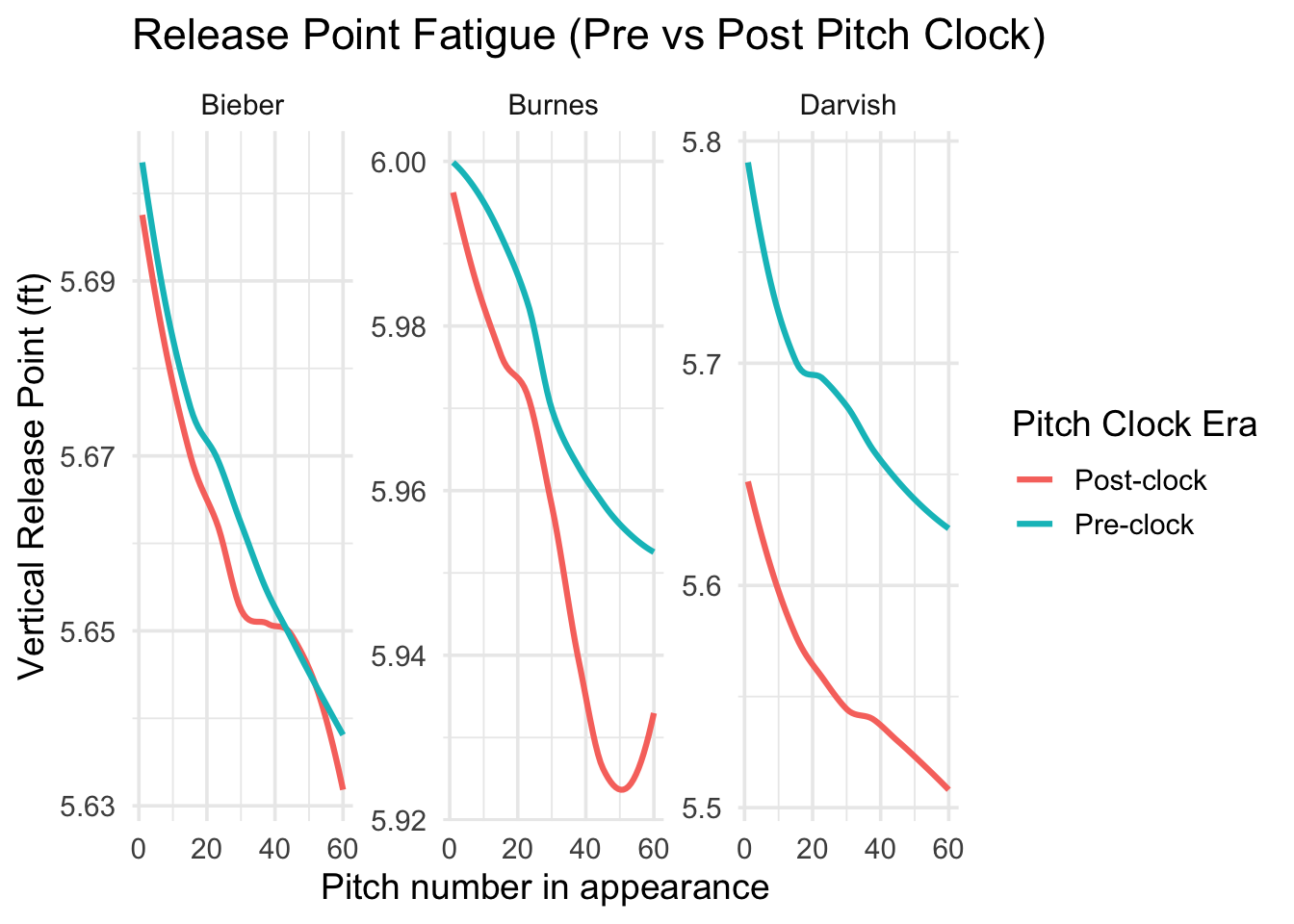
To examine whether pitchers’ vertical release points also show signs of fatigue, I built a set of regression models using vertical release point. These models follow the same structure as the velocity and extension fatique analyses, predicting vertical release point as a function of pitch number, pitch-clock era, their interaction, and two controls: inning and pitch type. I again restricted the data to the first 80 pitches of an appearance to avoid outliers from unusually long starts.
fit_release_point_model <- function(df) {
  df_model <- df |>
    filter(
      !is.na(release_pos_z),
      !is.na(pitch_in_app),
      pitch_in_app <= 80
    )

  lm(
    release_pos_z ~ pitch_in_app * post_clock + inning + pitch_type,
    data = df_model
  )
}

model_rp_darvish <- fit_release_point_model(darvish_f)
model_rp_bieber  <- fit_release_point_model(bieber_f)
model_rp_burnes  <- fit_release_point_model(burnes_f)

rp_results <- bind_rows(
  tidy(model_rp_darvish) |> mutate(pitcher = "Darvish"),
  tidy(model_rp_bieber)  |> mutate(pitcher = "Bieber"),
  tidy(model_rp_burnes)  |> mutate(pitcher = "Burnes")
) |>
  filter(term %in% c("pitch_in_app", "pitch_in_app:post_clock")) |>
  select(pitcher, term, estimate, std.error, p.value)

rp_results
# A tibble: 6 × 5
pitcher term estimate std.error p.value
<chr> <chr> <dbl> <dbl> <dbl>
1 Darvish pitch_in_app -0.00410 0.000183 4.83e-109
2 Darvish pitch_in_app:post_clock 0.0000369 0.000180 8.38e- 1
3 Bieber pitch_in_app -0.000804 0.0000983 3.22e- 16
4 Bieber pitch_in_app:post_clock 0.000234 0.000108 3.05e- 2
5 Burnes pitch_in_app -0.000806 0.0000637 1.75e- 36
6 Burnes pitch_in_app:post_clock -0.000608 0.0000924 4.99e- 11Finally, I plotted how each pitcher’s vertical release point changes as their pitch count increases.
combined <- bind_rows(
  darvish_f |> mutate(pitcher = "Darvish"),
  bieber_f  |> mutate(pitcher = "Bieber"),
  burnes_f  |> mutate(pitcher = "Burnes")
)

combined |>
  filter(pitch_in_app <= 60) |>
  mutate(clock_label = ifelse(post_clock == 0, "Pre-clock", "Post-clock")) |>
  group_by(pitcher, clock_label, pitch_in_app) |>
  summarise(mean_release = mean(release_pos_z, na.rm = TRUE), .groups = "drop") |>
  ggplot(aes(pitch_in_app, mean_release, color = clock_label)) +
  geom_smooth(se = FALSE, linewidth = 1.1) +
  facet_wrap(~ pitcher, scales = "free_y") +
  theme_minimal(base_size = 14) +
  labs(
    title = "Release Point Fatigue (Pre vs Post Pitch Clock)",
    x     = "Pitch number in appearance",
    y     = "Vertical Release Point (ft)",
    color = "Pitch Clock Era"   # updated legend title
  )
Across all three fatigue metrics, velocity, release extension, and vertical release point, the regression models for starters did not detect statistically significant changes in fatigue slopes after the pitch clock was introduced. The interaction terms that test the research question “Does fatigue accelerate in the pitch clock era?” produced p-values above common significance thresholds, signaling that the models did not capture clear evidence of a structural shift in within-appearance fatigue patterns. While these coefficients provide helpful context, the visualizations offer the most interpretable representation of how the pitch clock affected pitcher fatigue.
The velocity fatigue curves showed a consistent pattern: velocity was generally lower in the pitch-clock era across all three starters, Darvish, Bieber, and Burnes, even though the slope of velocity decline within outings remained similar. In other words, pitchers tend to start and end their outings a bit slower post-clock, but they do not lose velocity at a faster rate pitch-by-pitch. Among the three, Darvish displayed the clearest drop in initial velocity in the post-clock years, which aligns with expectations given his age (mid to late 30s). Bieber and Burnes who are both in their twenties during the pitch-clock transition also exhibited small downward shifts in average velocity, but these could not be tied to accelerated fatigue within outings. Their fatigue curves show nearly parallel trajectories pre and post-clock.
The release-extension visualizations told a similar story. For all three starters, extension declined slightly across appearances, but the pitch-clock era did not meaningfully steepen these slopes. Darvish again showed the largest pre vs. post-clock difference in average extension, consistent with age-related decline. Bieber and Burnes showed minimal differences in their extension curves, suggesting that the pitch clock did not force younger starters into earlier or more rapid biomechanical collapse.
Finally, the vertical release-point plots revealed small decreases in height over the course of outings but again, the slopes remained remarkably consistent across eras. The differences again were in the baseline level of release height, not in the rate of decline. Darvish’s post-clock release point started slightly lower than in earlier seasons, while Bieber and Burnes showed near-overlapping curves across eras.
These results suggest that while the pitch clock may not be increasing within-appearance fatigue, it does appear to be associated with pitchers throwing slower overall. This is especially pronounced for Yu Darvish, and aging likely plays a role in his case. His decline in velocity and extension may reflect natural wear, making it harder to separate the effects of the pitch clock from the effects of a long career. In contrast, Bieber and Burnes are younger, so their slower post-clock velocities are less likely to be age-driven, which makes their drop in average speed more interesting. Even though their models did not show significantly faster fatigue, the consistent downward shift in baseline velocity across the visuals suggests that the faster pace of play may reduce recovery between pitches enough to impact overall output.
Another useful takeaway is how differently starters and relievers behave in this type of analysis. The relievers in the dataset (Jansen and Gallegos) produced extremely inconsistent curves with unusual trends, including velocity increasing across an outing. Their usage is too unpredictable with short outings, high pressure, and less predictable usage to produce reliable fatigue patterns. This is why the analysis ultimately focuses on the three starters.
A major limitation of this project is that aging effects cannot be fully separated from pitch-clock effects, especially for Darvish. His career stage makes it difficult to know whether declines in velocity and extension reflect the rule change or natural aging. Another limitation comes from sample sizes: even though Statcast contains pitch-level data, the number of appearances for each pitcher in each era is not very large, which makes model estimates noisy and harder to interpret.
There are also limitations related to pitcher role. Relievers behave too inconsistently to include in this kind of fatigue study, since their outing length, recovery patterns, and intensity vary far more than starters. For this reason, the results are based only on three starting pitchers, which limits generalizability. Finally, because the pitch clock was implemented league-wide at the same time, there is no true control group, so every comparison relies on pre/post differences that may be influenced by outside factors unrelated to the rule change.